Nitesh Jemni is the first UI/UX designer of Grofers. He is currently working as the UI/UX Design Lead.
Hyperlocal is the new buzzword in town. There are a lot of new startups in the market racing to become the market leader, and Grofers is a frontrunner in that race. Delightful customer experience, on-time delivery, quality products and great product packaging are a few of the many reasons that make Grofers the first choice for over 1.8 million satisfied users. On hearing the word ‘Grofers’, if the colour orange and our logo pop up in your head, I would be satisfied about doing a good job designing the company’s logo. Here’s an account on how the logo of Grofers came into existence.
In November last year, I joined Grofers as its first designer. It was my third job change within a span of 6 months, so my hopes were obviously not very high. The first impression of the Grofers office too did not inspire any confidence in me. It was a small and congested two-room office in Sector 18, Gurgaon. I entered the office and observed that there were around 20 people there, so engrossed in their work that they did not even notice me. Soon, I was introduced to the whole team, some quick pleasantries were exchanged, and everyone got back to work within seconds. For someone who had worked in offices where people tried to find the smallest of excuses to get away from work, this was quite shocking. This got me thinking that maybe, just maybe, I have come to the right place.
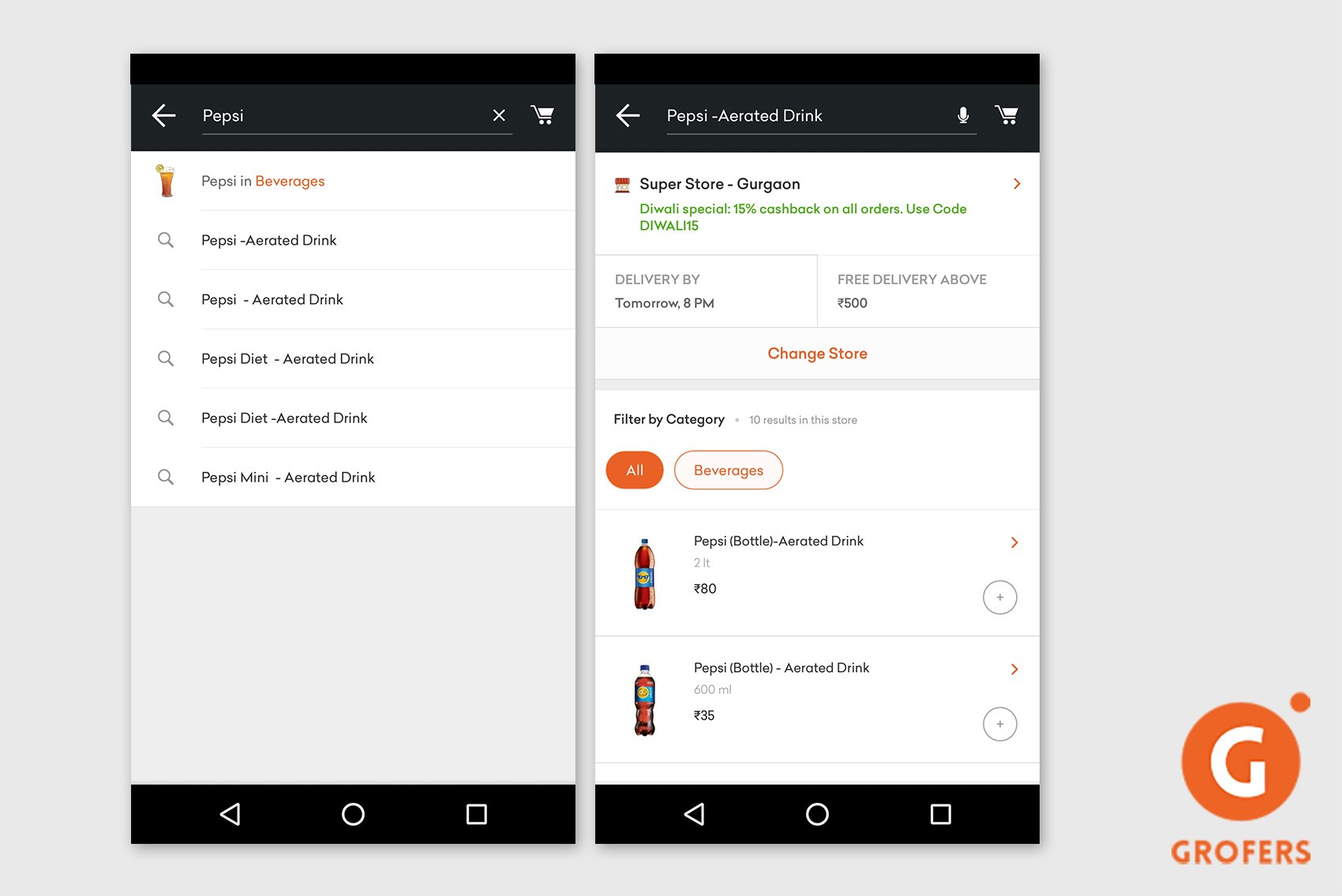
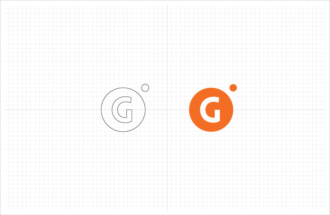
My first task was to set up a visual design language for Grofers, which would be used across all platforms - mobile, web, marketing material, packaging and so on. I immediately realised that to succeed in this task, it was crucial to get the logo right, given that everything else will be built on top of that. Most of the renowned brands in the world have great logos - logos that are simple and elegant, yet appealing enough that the logo is the first thing that comes to one’s mind on hearing the company’s name. The Grofers logo in 2014 was very simple: It was ‘Grofers’ written in white in the Lovelo Black font on a burnt orange coloured background. It was a decent logo and I loved the font that was used, but there was nothing impressive about it. Firstly, the colour used was dull orange - something that would not grab a user’s attention easily. Secondly, it was not a sustainable option to keep the whole brand name in the logo because it could create problems when used in multiple platforms.
The biggest challenge in designing something is that design is a very subjective concept. What I mean by this is that what you think looks like a good design might not impress everyone else. To come up with something that pleases a majority of people is always a difficult task. At this point, I remembered my childhood hero Paul Rand, the iconic designer who has created some of history’s most recognisable logos, including those of IBM and UPS.
In his own words: “Design is so simple, that is why it is so complicated.” The best design is the one that is so simple that you won’t even notice that it exists. It is never in your face, but will never let itself be forgotten by the viewer. With this philosophy in mind, I sat down to create the logo, and spent the next few days conceptualising it. It was really frustrating because the hardest problem to solve is often not the one without solutions, but the one with several obvious solutions. There were a lot of options such as using a delivery bag, a grocery list, a delivery bike and so on, and this confused me.
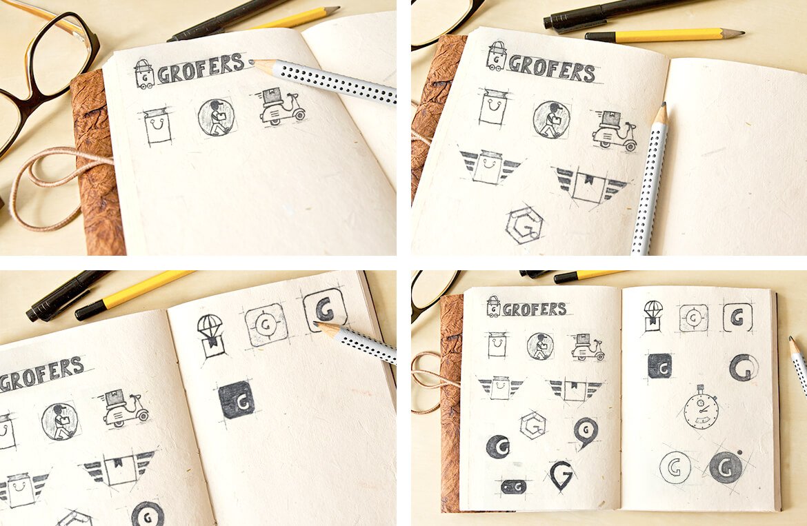
I sketched those thoughts in a scrapbook, but I wasn’t completely happy with any of the logos I came up with. This forced me to think if I was approaching the problem from the right direction. While I wanted to create a symbol that represents Grofers to people, I was myself confused about what Grofers means to me. Therefore, I started contemplating on what everyone thought about Grofers and why they believed in this startup. I finally got the answer I was looking for. Here’s what a colleague of mine said - “The essence of Grofers as a service is based on the fact that we empower you to shop for all your daily needs, thus saving you the effort and your valuable time, which you can utilise to do something you love.”
That’s when it struck me!
“Time”- that was what I was looking for. Time is the most important asset that Grofers gives you, and unlike other assets, it’s not something that you can get back once you lose it. From there on, it was a smooth ride. I finalised on the image of a stopwatch to convey the concept of time and my love for the Lovelo Black font resulted in me using the same font for the letter ‘G’ in the logo. A vibrant shade of orange replaced the earlier dull shade. Finally, the logo emerged with 2 orange circles; the larger circle had letter ‘G’ written on it in white, and the smaller circle was placed on the top right side of the bigger one, thereby giving the logo a vague outline of a stopwatch. Voilà! The Grofers logo was ready! I showed it around to people in the office and it was an instant hit. I finally breathed a silent sigh of relief.
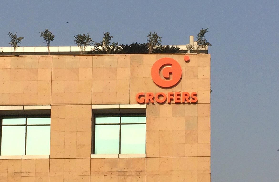
It’s been almost a year since all this happened. Now, looking back at it, I still can’t believe that what started off as a design exercise went on to become the face of a multi-million dollar company with an ever-growing user base. It gives me immense pleasure whenever I see it. The huge logo that I see every morning on top of the Grofers building is one of my biggest sources of inspiration.
I would like to believe that I have done a decent job at designing the logo because over the past few months, a lot has changed in the company - we changed 2 offices, we saw new people join us, we released a new consumer app and we even changed our business model, but the only thing that remains constant is the Grofers logo. Grofers is now like an ever-growing machine with a lot of gears and cogs working in unison towards a greater goal, but personally I like to believe that it was this logo that made the clock start ticking for Grofers.
Tick-tock, tick-tock...